
After many years of vague memories, I finally sat down to organize my thoughts on CSS Layout. The trigger was wasting a lot of time today arranging some easy boxes, indicating that I still have gaps in my understanding of CSS concepts. In today’s era where the position system is no longer commonly used, we will use TailwindCSS as the basis to clear up some concepts and applications.
Reflections Triggered by Flexbox
Reference: https://css-tricks.com/snippets/css/a-guide-to-flexbox/
The main idea behind the flex layout is to give the container the ability to alter its items’ width/height (and order) to best fill the available space (mostly to accommodate all kinds of display devices and screen sizes)
Flexbox is relatively new compared to fixed-size containers (such as a container with a fixed width of 200px and height of 100px, which obviously can only be arranged by positioning elements, but this approach is outdated in today’s era of Responsive Design).
Another advantage of TailwindCSS is that it determines element sizes based on rem, which provides more flexibility in web design.
OK, so what is rem? By googling, we can easily find that the default font size of the screen is 16px.
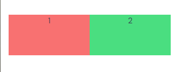
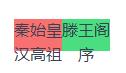
The base unit in TailwindCSS is 1=0.25rem, let’s denote this unit as T, then 1T=0.25*16px=4px and 4T=1rem. This means that four TailwindCSS units are required to achieve a standard font size. By adjusting the width of each box to 4*3=12T and the height to 4*2=8T, each box should be able to accommodate two lines of abc. Note that to demonstrate the standard size, we need to add the break-words attribute to forcefully display broken words, i.e., characters wrapping within the box boundaries.
But the result was different from what we expected. The box size was indeed 16*3=48px, but there were more than three English characters. What about Chinese characters?
Reference:
https://iamvdo.me/en/blog/css-font-metrics-line-height-and-vertical-align
https://juejin.cn/post/6971673576017494053?from=search-suggest#heading-5
How do CSS line height and font size behave?
We use the font review tool fontforge to examine the specific design size of individual characters.
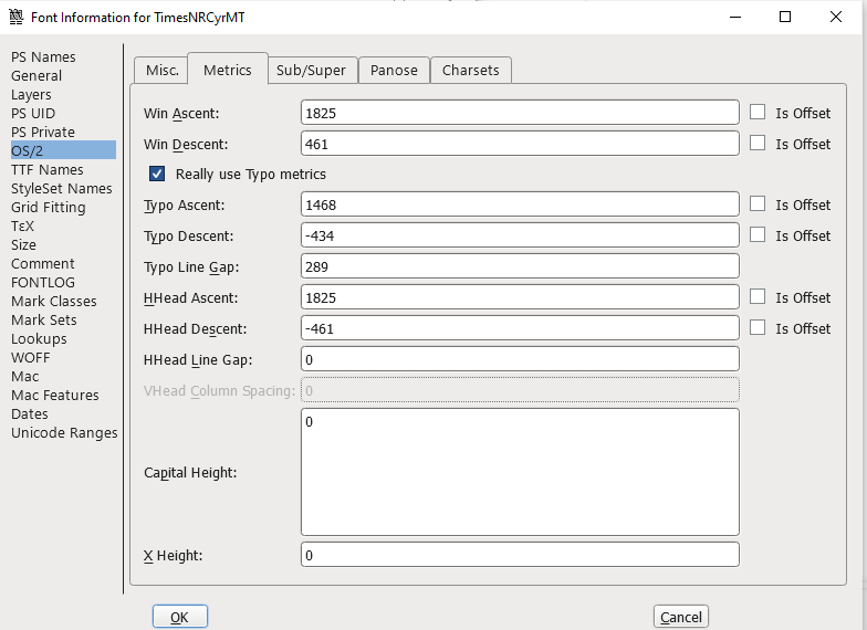
For the TIMES NEW ROMAN font: (em units=2048)
Parameters for Catamaran: (em units=1000)
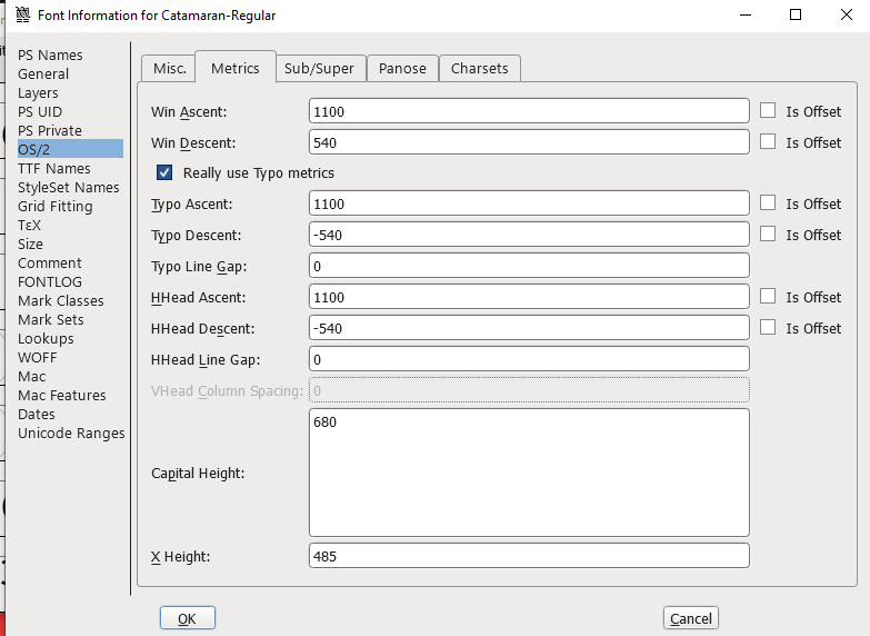
If you are using Windows, use the parameters win ascent, win descent, and typo line gap. If you are using a Mac, use the parameters HHead Ascent, HHead Descent, and HHead Line Gap to represent the values of ascent, descent, and line gap mentioned below.
There is an important misconception here (I will test this with other software later): the CSS line-height does not equal the distance between the baselines of two fonts.
Based on most font tests, the content-area (i.e., the background area where the font will be colored, not the font itself’s upper and lower bounds) is greater than the font’s standard size (e.g., 16px here).
Therefore, line-height:1 will cause issues; whereas line-height:normal with a line gap of 0 in fontforge makes line-height equal to content-area. If there are no other obstacles, the height of the outer box is equal to the line-height.
For fonts with a non-zero line-gap (very rare), the height of the line-gap is evenly added to the gap between two lines of colored areas, resulting in line-height not equaling content-area.
Today, by generating icons the same size as the font, we no longer need to worry about aligning icons and text. With the support of UnoCSS, it only takes one or two lines of code:
<div flex text-100px>
    <div i-carbon-logo-github />
    <p>Majimay</p>
</div>

(Aligned by baseline)